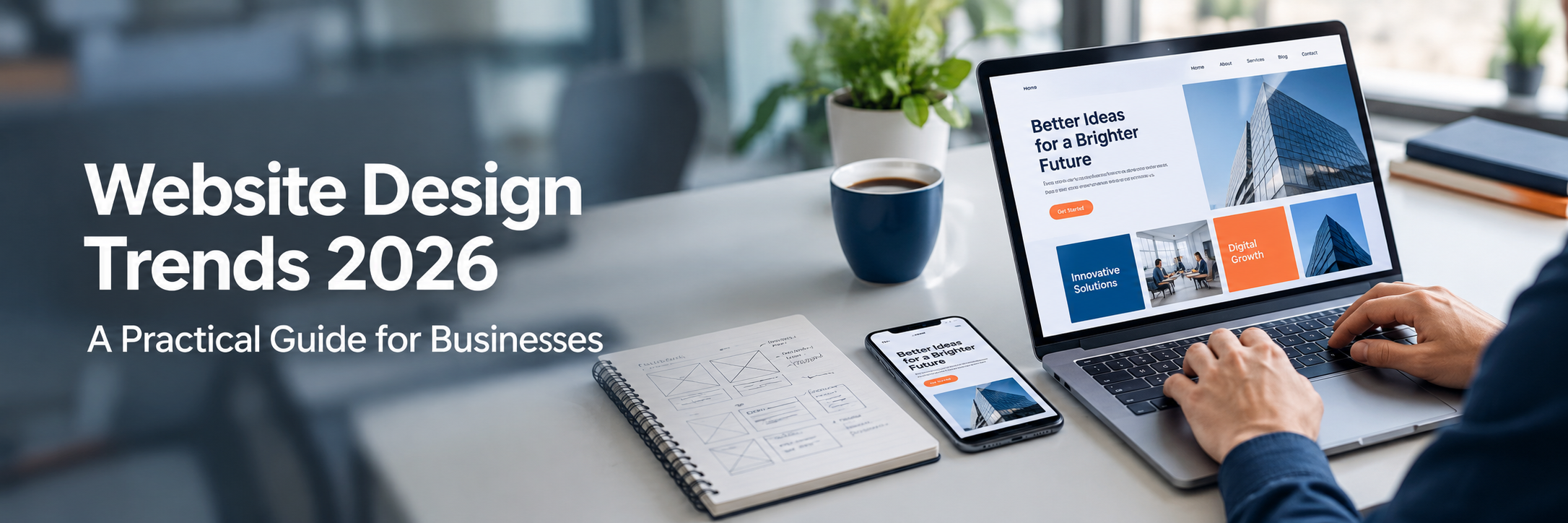
Website Design Trends 2026: A Practical Guide for Businesses
Quick Answer: Website design trends in 2026 focus on AI-assisted experiences, personalization, accessibility, fast performance, mobile-first layouts, design systems, and trust. They matter because users expect clear, fast, usable websites. Businesses should adopt trends selectively, based on user needs, brand goals, accessibility, SEO, and performance, instead of copying every new visual style.
Every year brings a new wave of website design ideas. Some are useful. Some look good in a presentation and fall apart in real use. The hard part is knowing the difference.
This guide is written for founders, marketers, website owners, and business leaders who are planning a new site or a redesign. It explains what the trends are, why they are growing, where they help, and where they can cause problems.
We will also separate visual trends from usability, technical, accessibility, and business trends. They are not the same thing, and they should not be judged the same way.
What Are Website Design Trends in 2026?
Website design trends are the layouts, visual styles, interaction patterns, and technical approaches that many designers and development teams are adopting at a given time. They reflect changes in user behavior, devices, tools, and expectations.
Not every trend is new. Some are established practices, such as responsive design and accessibility, that are now treated as a baseline. Others are emerging, such as AI-assisted interfaces and adaptive content.
It helps to group them into five types:
- Visual trends, such as bold typography, bento layouts, and immersive visuals
- UX trends, such as simpler navigation, clear hierarchy, and faster lead or checkout flows
- Technical trends, such as headless CMS, API-driven websites, and performance-first builds
- Accessibility trends, such as accessible-by-default components and reduced motion options
- Business trends, such as trust-focused design, personalization, and conversion-focused pages
Why Do Website Design Trends Matter in 2026?
Design trends matter because user expectations change. People compare your website with the best experiences they have used anywhere, not just with your direct competitors.
A website that feels slow, confusing, or outdated can reduce trust. A website that is clear, fast, and easy to use can make it simpler for people to find answers and take action. The effect depends on your audience, content, and offer.
Trends also matter because tools are changing. AI features, modern frameworks, and better browser capabilities make some designs easier and cheaper to build than before. Understanding them helps you make informed decisions with your design and development team.
Still, a trend should never replace usability, accessibility, performance, or strong content. Those are the foundations. Trends sit on top of them.
What Are the Biggest Website Design Trends in 2026?
The biggest trends include AI-assisted experiences, personalization, intentional minimalism, purposeful motion, accessible-first design, mobile-first layouts, performance-first development, modular design systems, and trust-focused design.
Some of these are mature practices that every website should follow. Others are better suited to specific industries or budgets. The table below gives a quick view.
| Trend | Type | Potential Business Benefit | Main Caution |
|---|---|---|---|
| AI-assisted experiences | UX and technical | Faster answers and better content discovery | Incorrect answers and privacy risks |
| Personalization | Business and UX | More relevant content for each visitor | Data handling and consent |
| Intentional minimalism | Visual | Clearer focus and lighter pages | Can hide useful information |
| Purposeful motion | Visual and UX | Better feedback and guidance | Slow pages and distraction |
| Accessible-first design | Accessibility | Wider audience and fewer usability barriers | Needs planning from the start |
| Performance-first builds | Technical | Faster loading and smoother use | May limit heavy visual effects |
| Design systems | Technical and brand | Consistency and faster delivery | Setup effort at the start |
| Headless CMS | Technical | Flexible content across channels | More complexity than simple sites need |
AI-Powered and Adaptive Website Experiences
AI-powered website experiences use machine learning or language models to change what a visitor sees or how they find information. Examples include smarter site search, recommendations, and adaptive page sections.
This is becoming relevant because tools from providers such as OpenAI, Google, and cloud platforms like Microsoft Azure, AWS, and Google Cloud are easier to connect through APIs than they were a few years ago.
For users, the benefit is speed. A visitor can describe what they need and get to the right page faster. For businesses, this can reduce friction in long catalogs, large knowledge bases, and complex service pages.
The drawbacks are real. AI can produce wrong information. It can also frustrate people if it replaces simple navigation. Businesses may want to avoid it when the site is small, the content is already easy to browse, or the team cannot monitor and improve the feature.
Personalization and Dynamic Content
Personalization means changing content based on who the visitor is or what they have done. It can be as simple as showing a returning customer a relevant offer, or as advanced as adapting a homepage by industry.
It helps most when a business serves different audiences with different needs. A software company, for example, might show different examples to a startup founder and an enterprise IT manager.
Be careful with data. Personalization should follow privacy laws and clear consent practices. It should also stay predictable. If the page changes too much, users may feel lost or watched.
For SEO, make sure important content is still visible to search engines and does not depend entirely on user-specific scripts.
Minimalist and Intentional Design
Minimalism in 2026 is less about empty space and more about purpose. Every element on the page should earn its place.
This approach improves focus. Visitors see the main message, the main action, and the key proof points without digging through clutter. It also tends to help performance, since fewer elements usually load faster.
Minimalism can go wrong when it removes useful detail. A technical buyer, for example, may need specifications and documentation. A healthcare patient may need clear contact and location details. Simple should not mean incomplete.
Micro-Interactions and Motion Design
Micro-interactions are small responses to user actions. A button changes state when pressed. A form field shows a clear error. A cart icon updates after an item is added.
Motion design is the wider use of animation. Good motion supports navigation, feedback, hierarchy, or storytelling. Bad motion slows the page and distracts users from the task.
A simple test works well. If the animation helps the user understand something, keep it. If it only decorates the page, ask whether it is worth the performance cost.
Always respect the reduced motion setting in browsers. Some users get dizzy or distracted by movement, and WCAG guidance covers this need.
Scroll-Based Storytelling
Scroll-based storytelling reveals content step by step as the user scrolls. It is common on product launch pages, brand stories, and case studies.
It can make complex ideas easier to follow, because each step builds on the last. It can also hold attention on long pages.
However, heavy scroll effects can hurt mobile performance and make pages harder to navigate by keyboard. They may also hide content from users who want to scan quickly. Consider this style for campaigns and brand pages, and avoid it for pages where people need fast answers, such as support or pricing pages.
Immersive and Interactive Visual Experiences
Immersive design includes 3D elements, interactive product viewers, and live demonstrations. Libraries built on WebGL and tools such as Three.js make these experiences possible in the browser.
These can be valuable when the product is hard to explain with text or images. A furniture brand, a car maker, or a hardware company can let users explore a product from every angle. A software company can offer a simple interactive demo.
The cost is performance and complexity. 3D assets can be large, and older devices may struggle. Businesses should consider them only when they clearly help the user understand the offer, and should provide a lighter fallback.
Bold Typography and Editorial Layouts
Large headlines, expressive fonts, and magazine-style layouts help brands stand out. Variable fonts support this trend, since one font file can offer many weights and widths.
The benefit is a clear visual hierarchy. Users can tell what matters most within seconds. Editorial layouts also work well for content-heavy brands, such as media sites, agencies, and thought leadership hubs.
Readability must come first. Very large or unusual type can be hard to read on small screens. Optimize fonts by limiting styles, using modern formats, and loading them efficiently so text does not flash or shift.
Bento and Modular Layouts
Bento layouts organize content into clean boxes of different sizes, similar to a bento lunch box. Many product and feature pages now use this pattern.
The layout makes it easy to scan several ideas at once. It also fits well with component-based development, since each block can be built and reused.
It works best for feature summaries, dashboards, and portfolios. It works less well for long explanations, where a simple linear layout is easier to read. On mobile, the boxes should stack in a logical order.
Accessible-First Design
A website is accessible when people with different abilities can perceive, understand, navigate, and interact with it. This includes people who use screen readers, keyboards, voice control, or zoom.
The Web Content Accessibility Guidelines, known as WCAG, are published by the W3C and are the common reference. Accessible-first design means building these needs into components and workflows from the beginning, instead of fixing problems after launch.
The benefit goes beyond compliance. Clear contrast, good labels, and logical structure improve usability for everyone, including people on small screens or in bright light. The main drawback is that it needs planning and testing, but it is usually cheaper than fixing a finished site.
Mobile-First and Responsive Design
Responsive design means a website adapts to different screen sizes. Mobile-first design means the team designs for the smallest screen first, then expands the layout for tablets and desktops.
This is no longer a trend in the strict sense. It is standard practice. What is changing is the depth. Teams now think about touch targets, thumb reach, slower networks, and mobile-friendly forms.
Mobile-first thinking forces useful decisions. If a section does not fit on a phone, it may not be essential. Test on real devices, not only on browser simulators, because real phones behave differently.
Performance-First Website Design and Core Web Vitals
Performance-first design treats speed as a design requirement, not a final polish step. Core Web Vitals are Google metrics that measure loading speed, responsiveness, and visual stability from the user's point of view.
Tools such as Google Lighthouse and PageSpeed Insights help teams measure these. Good scores support a better experience and are part of Google's page experience signals. They do not guarantee rankings, since content relevance and quality still matter most.
A visually impressive website can still perform badly. Large images, autoplay video, heavy scripts, and many third-party tags can slow even a well-designed page. Teams should set a performance budget early and design within it.
Dark Mode and User-Controlled Interfaces
Dark mode offers a darker color scheme. User-controlled interfaces go further, letting visitors adjust theme, text size, motion, or density.
This helps users who prefer lower brightness or who have visual sensitivities. Modern browsers can read the user's system preference, so the site can respond automatically.
The challenge is design effort. Every color, image, and component must work in both modes with enough contrast. For a simple brochure site, dark mode may not be worth the extra work. For apps, dashboards, and content-heavy sites, it can be a useful option.
Conversational Interfaces and AI Assistants
A conversational interface lets users type or speak a request and get a response. On websites, this usually appears as a chatbot, a guided assistant, or a smarter search box.
It can handle common questions, guide users to the right page, collect lead details, and support customers outside business hours. It also fits the growth of voice search and conversational search habits.
The risks are wrong answers, privacy concerns, and over-automation. Users should be able to reach a human easily. Assistants should draw from approved content, state their limits, and avoid collecting sensitive information without a clear reason.
Privacy and Trust-Focused Design
Trust-focused design makes it clear who you are, how you handle data, and what users can expect. It includes transparent privacy notices, simple consent choices, visible contact details, real testimonials, and clear policies.
This matters because users are more careful about sharing information. It matters even more in healthcare, finance, and legal services.
Avoid dark patterns, such as confusing cookie banners or hidden unsubscribe options. They may increase short-term sign-ups but damage long-term trust. Keep forms short and ask only for the information you truly need.
Design Systems and Brand Consistency
A design system is a shared library of design rules and reusable components. It includes colors, fonts, spacing, buttons, forms, and interaction patterns, along with guidance on how to use them.
Teams use tools such as Figma to design components and frameworks such as React to build them. When design and code share the same components, the website stays consistent as it grows.
The benefits include faster delivery, fewer inconsistencies, and easier accessibility testing. The cost is the upfront effort. Small websites may only need a lightweight style guide, while larger organizations usually gain more from a full system.
Headless CMS and Modern Web Architecture
A traditional CMS, such as WordPress, manages content and displays it through built-in themes. A headless CMS stores content separately and delivers it through APIs to any front end, such as a website built with Next.js, a mobile app, or a kiosk.
This gives teams more freedom in design and performance. It also helps businesses publish the same content across several channels. Composable architecture takes this idea further by combining specialized services for search, commerce, and personalization.
It is not always the right choice. A simple business website may work well on WordPress or a hosted builder such as Webflow, with lower cost and less maintenance. Choose the CMS based on your team, content needs, and growth plans, not on popularity.
Conversion-Focused Website Design
Conversion-focused design helps visitors complete a goal, such as booking a demo, filling out a form, or buying a product. It uses clear calls to action, simple forms, relevant proof, and focused landing pages.
Many businesses are also simplifying checkout and lead forms. Fewer fields, clear progress, and guest options can reduce friction.
No design pattern guarantees more conversions. The impact depends on your audience and offer. Use analytics and A/B testing to learn what works for your visitors, and change one thing at a time so the results are clear.
How Is AI Changing Website Design in 2026?
AI is changing both how websites are made and how they behave. Design teams use it for research, early concepts, copy drafts, and code assistance. Visitors meet it in search, chat, and recommendations.
It is a tool, not a replacement for design judgment. People still need to set goals, review quality, and make decisions about accessibility, brand voice, and ethics.
Practical use cases include:
- AI-powered site search that understands natural questions
- Conversational assistants for common support questions
- Personalized product or content recommendations
- Dynamic content that adapts to the visitor's industry or interest
- Lead qualification through guided questions
- Content discovery across large libraries
- Automated first-line customer support
The limits matter just as much. AI can state wrong information with confidence. It can raise privacy concerns when user data is involved. It can frustrate users if there is no human option. Strong teams add review steps, use approved content sources, and track how people actually use these features.
| AI Website Feature | Best Use | Main Risk |
|---|---|---|
| AI site search | Large catalogs and knowledge bases | Irrelevant results if content is poorly organized |
| Website chatbot | Common questions and lead capture | Wrong answers and user frustration |
| Recommendations | E-commerce and content sites | Privacy concerns and repetitive suggestions |
| Dynamic content | Multi-audience business sites | Confusing or inconsistent experiences |
What Makes a Website Design Modern in 2026?
A modern website is fast, accessible, mobile-friendly, secure, and clear. It helps users reach their goal with little effort and reflects the brand consistently.
Modern does not mean the most animated or the most experimental. It means the site meets current user expectations and uses current technology sensibly.
| Area | Older Approach | Modern Approach |
|---|---|---|
| Layout | Desktop first, fixed widths | Mobile-first, flexible and responsive |
| Accessibility | Checked at the end | Built into components from the start |
| Performance | Fixed after launch | Planned with a performance budget |
| Branding | Page by page design | Shared design system |
| Content | Static for all visitors | Structured, and personalized where useful |
| Improvement | Redesign every few years | Continuous testing and optimization |
Which Website Design Trends Should Businesses Adopt?
Businesses should adopt trends that solve a real user or business problem. Accessibility, mobile-first design, performance, and clear hierarchy are strong starting points for almost every site.
Trends such as 3D visuals, scroll storytelling, and AI assistants are more selective. They suit certain products, audiences, and budgets.
How Should Businesses Choose Website Design Trends?
Use a simple filter before adopting any trend. Ask these questions:
- Does it help our users complete their tasks?
- Does it support our business goals?
- Can we make it accessible?
- What is the effect on speed and SEO?
- Can our team maintain it?
- How will we measure whether it works?
If a trend fails two or three of these, wait or try a smaller version. Pilot it on one page, measure results, and then decide.
Website Design Trends for Different Business Types
Design priorities change with audience, industry, compliance needs, sales cycle, and goals. A trend that works well for a consumer brand may be wrong for a regulated service.
Startups
Startups need clarity and speed. A focused homepage, strong messaging, quick loading, and a simple conversion path matter more than advanced effects. A lightweight design system helps the team stay consistent as the product grows. Interactive demos can help if the product is new and needs explanation.
SMEs
Small and medium businesses usually benefit from practical choices. Mobile-first design, local SEO-friendly structure, clear service pages, trust signals, and easy contact options often deliver the most value. A well-supported CMS is often more useful than a complex architecture.
Enterprises
Enterprise websites often have many teams, regions, and content owners. Design systems, accessibility governance, strong security, and scalable architecture matter most. Headless or composable setups can help, but they need clear ownership and planning. Change is usually slower, so testing should be thorough.
E-commerce
Online stores depend on speed, product clarity, and trust. Fast product pages, good image handling, simple filters, clear delivery information, and short checkout flows are priorities. Personalized recommendations and product viewers can help, but they should not slow the path to purchase.
SaaS
SaaS websites need to explain a product quickly. Clear value statements, bento-style feature sections, product walkthroughs, pricing clarity, and documentation access are common priorities. Conversion paths should fit the sales cycle, such as free trial, demo request, or contact sales.
Professional Services
Law firms, consultants, and agencies sell trust and expertise. Clear service pages, author profiles, case studies, and simple contact steps matter. Editorial layouts and strong typography can express credibility, while heavy effects usually add little.
Healthcare
Healthcare websites must be accessible, clear, and careful with data. Patients may be stressed, older, or using assistive tools. Simple navigation, large readable text, easy appointment booking, and strong privacy practices are essential. Compliance requirements depend on the country and should be reviewed with qualified advisors.
Financial Services
Financial websites need trust, clarity, and security. Clear explanations, transparent policies, secure forms, and accessible calculators are valuable. Personalization may help, but it must follow strict data and regulatory rules.
Real Estate and Technology Companies
Real estate sites benefit from fast image galleries, map search, and virtual tours, with careful media optimization. Technology company sites often balance product storytelling with technical depth, so documentation, integration details, and clear architecture explanations matter.
| Business Type | Recommended Design Priorities |
|---|---|
| Startup | Clear messaging, speed, simple conversion path |
| SME | Mobile-first layout, trust signals, easy contact |
| Enterprise | Design system, accessibility governance, security, scalability |
| E-commerce | Performance, product clarity, short checkout |
| SaaS | Product storytelling, pricing clarity, demos |
| Healthcare | Accessibility, simple navigation, data protection |
| Financial Services | Trust, security, clear explanations |
Common Website Design Mistakes to Avoid in 2026
The most common mistake is following a trend without checking whether users need it. Most other problems come from the same root: visuals taking priority over usability, speed, and clarity.
| Mistake | Practical Solution |
|---|---|
| Following trends without user research | Use analytics, interviews, and testing to guide choices |
| Overusing animation | Keep motion purposeful and support reduced motion settings |
| Putting visuals before performance | Set a performance budget and test with Lighthouse |
| Ignoring accessibility | Follow WCAG from the first design stage |
| Designing only for desktop | Start mobile-first and test on real phones |
| Excessive pop-ups | Limit them and avoid blocking key content |
| Using AI without human oversight | Review outputs, set limits, and offer human support |
| Confusing navigation | Simplify structure and test menus with real users |
| Poor content hierarchy | Lead with the main message and use clear headings |
| Slow-loading media | Compress files, use modern formats, and lazy load |
| Inconsistent branding | Use a design system and shared components |
| Ignoring SEO during redesign | Plan redirects, keep valuable content, and audit before launch |
| Skipping real device testing | Test across browsers, devices, and network speeds |
| No performance monitoring | Track Core Web Vitals and errors after launch |
| Choosing technology by popularity | Match technology to team skills and business needs |
How to Future-Proof Your Website Design
You cannot predict every change, but you can build a website that adapts well. Focus on strong foundations instead of chasing each new style.
- Use semantic HTML and clean code, so the site works across browsers and assistive tools
- Build with reusable components and a design system
- Separate content from presentation, using a CMS that fits your needs
- Choose scalable hosting, such as cloud platforms with a content delivery network
- Document decisions, so new team members can maintain the site
- Plan regular reviews, updates, and testing
Security belongs in this plan too. Visual design and security are separate concerns, but they should be planned together. Use HTTPS, secure authentication, protected forms with input validation, and secure APIs. Apply regular updates, manage dependencies carefully, control user access, and run security testing before and after launch. A beautiful site that is not secure puts users and the business at risk.
Website Design, SEO and User Experience
Design affects SEO through structure, speed, mobile usability, and content clarity. Search engines such as Google Search look at how well a page serves users, so good UX and good SEO often support each other.
SEO-friendly design uses clear headings, logical internal links, readable text, descriptive image alt text, and crawlable content. Content that loads only after complex scripts can be harder for search engines to process, so test how pages render.
Navigation and information architecture also matter. A clear structure helps users and search engines understand how pages relate. Strong content hierarchy helps visitors scan and helps search features identify answers. Design trends should never hide the content that people came to read.
Website Design and Accessibility
Accessible design supports more users and reduces barriers. It should be part of the plan from the first wireframe.
Key practices include:
- Full keyboard navigation with visible focus states
- Sufficient color contrast for text and controls
- Meaningful alt text for images
- Clear labels on every form field
- Semantic HTML for headings, lists, and landmarks
- Screen reader compatibility, tested with real tools
- Captions and transcripts for video and audio
- Accessible menus and dialogs
- Support for reduced motion preferences
Resources from the W3C and MDN Web Docs explain these topics in detail. Automated tools catch some issues, but manual testing with keyboards and assistive technology is still needed.
Website Design and Performance
Performance remains important because users leave slow pages and mobile networks vary. Performance also affects Core Web Vitals and overall usability.
| Performance Factor | Practical Approach |
|---|---|
| Images | Compress and use modern formats such as WebP or AVIF |
| Lazy loading | Load images and videos only when they are about to appear |
| Caching | Store reusable files so repeat visits load faster |
| CDN | Serve files from locations closer to users |
| JavaScript | Remove unused code and split large bundles |
| Fonts | Limit font files and use efficient loading |
| Video | Compress, avoid autoplay where possible, and use poster images |
| Third-party scripts | Audit regularly and remove tools that are not needed |
Development choices matter here. Frameworks such as React and Next.js can deliver fast experiences with server rendering and smart loading, but poor implementation can still create heavy pages. The tool does not guarantee the result. The team does.
Website Redesign Checklist for 2026
A redesign works best when it follows a clear process. Use this checklist to plan, build, test, and improve.
- Business objectives: define what the website must achieve and how success will be measured
- Target audience: describe who uses the site and what they need
- User research: review analytics, run interviews, and study current problems
- Information architecture: plan page structure and navigation
- Content audit: keep, update, merge, or remove existing content
- UX planning: create wireframes and user flows
- UI design: build visual direction and a design system
- Mobile responsiveness: design and test mobile layouts first
- Accessibility: check against WCAG at each stage
- SEO: plan redirects, metadata, headings, and internal links
- Core Web Vitals: set targets and test early builds
- Security: review hosting, forms, authentication, APIs, and dependencies
- Analytics: set up tracking for goals and key actions
- Conversion paths: review calls to action, forms, and key journeys
- Browser testing: check major browsers and versions
- Device testing: test real phones, tablets, and desktops
- Quality assurance: test functionality, content, links, and forms
- Launch planning: prepare backups, redirects, and a rollback plan
- Post-launch monitoring: track performance, errors, rankings, and user behavior
After launch, the work continues. Website maintenance, regular updates, A/B testing, and analytics reviews help the site improve over time. Many businesses also connect their website with CRM tools, cloud services, and automation as part of wider digital transformation.
Conclusion - Website Design Trends 2026
Website design trends in 2026 offer useful ideas, but they work best when chosen with care. The strongest websites are not the ones that use every new effect. They are the ones that are clear, fast, accessible, secure, and consistent with the brand.
Start with your users and your goals. Treat accessibility, mobile-first design, and performance as the base. Then add trends such as personalization, AI assistance, motion, or modular layouts where they bring real value.
Test, measure, and improve. A website is not a one-time project. With the right balance of design, development, and ongoing optimization, it can stay useful long after the trends change.
FAQ
Question: What are the biggest website design trends in 2026?
Answer: The main trends include AI-assisted and adaptive experiences, personalization, accessible-first design, mobile-first layouts, performance-first development, modular design systems, bold typography, purposeful motion, and trust-focused design. Their value depends on your audience and goals. Some are visual, some improve usability, and some are technical, so businesses should pick the ones that fit their users.
Question: What is the most important website design trend for 2026?
Answer: No single trend is right for every business. A bank may need trust and accessibility first. An online store may need speed and a simple checkout. A SaaS company may need clear product storytelling. The best starting point is your audience, your goals, and the problems users face on your current website.
Question: How is AI changing website design in 2026?
Answer: AI is changing how teams research, design, and personalize websites. It supports site search, chat assistants, product recommendations, content suggestions, and lead qualification. It also has limits. AI can give wrong answers, raise privacy concerns, and frustrate users when human support is missing. Teams get the best results when people review and guide AI features.
Question: Is minimalist web design still popular in 2026?
Answer: Yes, but it has become more intentional. Instead of removing everything, designers remove what does not help the user. That means clear hierarchy, focused layouts, readable text, and fewer distractions. Minimalism also helps performance, since fewer elements usually mean lighter pages. It works best when the content and navigation stay clear and useful.
Question: What role does accessibility play in website design?
Answer: Accessibility makes a website usable for people with different abilities, devices, and situations. It covers keyboard navigation, color contrast, alt text, form labels, captions, and semantic HTML. The WCAG guidelines from the W3C are the common reference. Accessibility works best when planned from the start, not added after launch.
Question: How important is mobile-first design in 2026?
Answer: It remains very important. Many visitors reach websites on phones, often on slower networks and smaller screens. Mobile-first design starts with the smallest screen, focuses on core content and actions, and then expands to larger screens. This approach tends to produce clearer layouts, lighter pages, and simpler navigation across all devices.
Question: Do website animations affect SEO and performance?
Answer: Animations do not affect SEO directly, but they can affect performance and usability. Heavy scripts, large video files, and complex effects can slow loading and hurt Core Web Vitals. Light, purposeful animation that supports navigation or feedback is usually safe. Teams should test on real devices and respect reduced motion settings.
Question: How can businesses improve website UX in 2026?
Answer: Start with user research and analytics to find real problems. Then simplify navigation, improve content hierarchy, speed up pages, fix mobile issues, and make forms easier. Test changes with real users and measure the results. Small, steady improvements based on evidence often work better than a sudden redesign driven by trends.
Question: Should every business follow the latest website design trends?
Answer: No. Trends can help, but only when they match user needs and business goals. Some trends add cost, slow pages, or confuse visitors. A good approach is to separate trends that improve usability and performance from those that are only visual, then adopt each one selectively and test it.
Question: How often should a business redesign its website?
Answer: There is no fixed schedule. Many businesses review their website every year and plan a larger redesign every three to five years, or sooner if goals, branding, or technology change. Signs it is time include poor mobile experience, slow speed, outdated content, accessibility gaps, or weak lead generation.
Question: What is a design system and why does it matter?
Answer: A design system is a shared set of rules, components, and guidelines for how a website looks and behaves. It covers colors, typography, buttons, forms, spacing, and patterns. It matters because it keeps branding consistent, speeds up development, reduces errors, and makes it easier to grow a website over time.
Question: What are Core Web Vitals?
Answer: Core Web Vitals are Google metrics that measure real user experience on a page. They focus on loading performance, responsiveness to input, and visual stability while the page loads. Businesses can check them with tools such as Google Lighthouse and Search Console. Good scores support a better experience, though they do not guarantee rankings.