UI vs UX Design: What's the Difference?
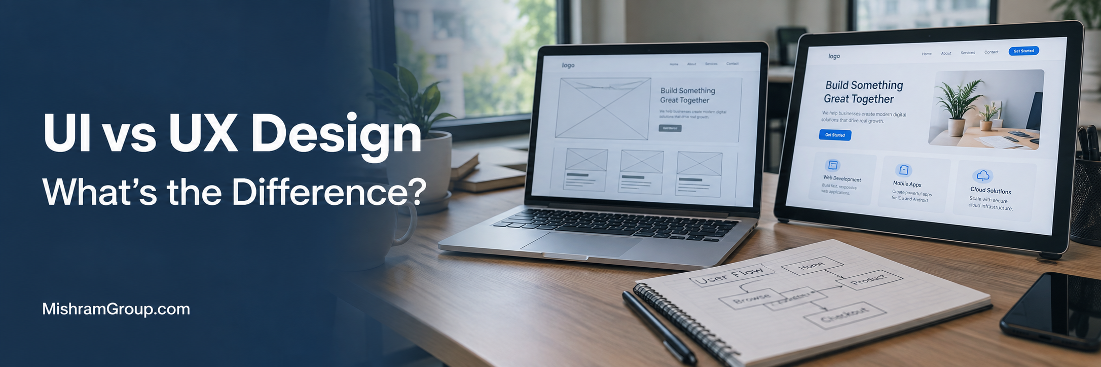
Quick Answer: UI design focuses on the look and interaction of a product, such as layout, colors, buttons, and typography. UX design focuses on the full experience, including research, structure, flows, and usability. UI is one part of the overall experience, but the two are not the same. Most digital products need both to be clear, usable, and effective.
People use the terms UI and UX as if they mean the same thing. They do not. The confusion is understandable, because the two disciplines work closely together and often share the same team.
For a business owner or product leader, the difference matters. It affects who you hire, what you budget for, and how you judge the quality of a website, app, or software platform.
This guide explains UI and UX in plain language. You will see how each one works, where they overlap, and how they affect real business outcomes.
What Is UI Design?
UI design is the design of the parts of a product that people see and interact with. It covers layout, typography, color, icons, spacing, buttons, forms, and other components.
UI stands for user interface. The interface is the point where a person meets a system. In a banking app, that includes the balance display, the transfer button, the input fields, and the confirmation screen.
UI is not just decoration. A good interface guides attention, shows what can be clicked, and gives feedback when something happens. It also has to work across screen sizes and input types.
UI designers usually think about questions like these:
- Which action should stand out most on this screen?
- Is the text easy to read?
- Do buttons, links, and fields look and behave the same way everywhere?
- What should the user see when a form has an error or a page is loading?
What Is UX Design?
UX design is the practice of shaping the whole experience a person has with a product. It looks at what users need, how they move through tasks, and where they get stuck.
UX stands for user experience. It starts before any screen is drawn. It includes research, structure, navigation, task flows, and testing. It can also reach beyond the screen, such as onboarding emails, support chats, or in-store steps.
ISO 9241 is a well-known family of standards on human-centered design and usability. Its usability definition focuses on effectiveness, efficiency, and satisfaction in a given context. That is a helpful way to think about UX.
UX designers usually ask questions like these:
- Who are the users, and what are they trying to do?
- What steps do they take, and where do they hesitate?
- Is the information organized in a way that makes sense to them?
- Can people complete key tasks without help?
What Is the Difference Between UI and UX Design?
The main difference is scope and focus. UI design shapes the interface layer, meaning the visual and interactive elements. UX design shapes the broader experience, meaning how well the product fits user needs and supports their goals.
UI is closely tied to the screen. UX is tied to the person and the task. A UI designer might refine a button style. A UX designer might ask if the user needs that button at all.
Here is a simple example. Picture a checkout page with a clean layout, good colors, and neat buttons. The UI looks strong. But shipping costs appear only on the last step, and the payment steps are unclear. Users feel surprised and leave. The UX is poor, even though the UI looks good.
The reverse can happen too. A checkout flow may be logical and short, but the text is tiny, the buttons look inactive, and the error messages are hard to see. The UX plan is sound, but the UI gets in the way.
UI vs UX Design Comparison Table
This table gives a quick side-by-side view. Real projects blur these lines, so treat it as a guide and not a strict rule.
| Category | UI Design | UX Design |
|---|---|---|
| Primary focus | Interface, visuals, and interactive elements | Overall experience, needs, and task success |
| Main goal | Make the product clear, consistent, and easy to operate | Help users reach their goals with less effort |
| Key questions | Is this clear, readable, and consistent? | Does this solve the user's problem in a logical way? |
| Typical activities | Layout, typography, color, components, states | Research, journey mapping, flows, testing |
| Common deliverables | Mockups, style guides, component libraries | Personas, user flows, wireframes, test reports |
| Tools | Figma, Sketch, Adobe tools | Figma, FigJam, Miro, analytics and research tools |
| Business impact | Can improve clarity, trust, and brand perception | Can improve task completion, retention, and conversion |
| Collaboration with developers | Specs, assets, components, and interaction details | Flows, requirements, edge cases, and test feedback |
How Do UI and UX Work Together?
UI and UX work together by turning user needs into a product people can actually use. UX sets the direction and structure. UI brings that structure to life through visual and interactive design.
They also check each other. If a UX flow looks good on paper but feels crowded in a mockup, the team goes back and adjusts. If a UI idea looks fresh but confuses testers, it gets reworked.
Think of a food delivery app. UX decides how users search, filter, reorder, and track an order. UI decides how restaurant cards look, how the cart button behaves, and how order status is shown. The user does not notice the split. They only notice if it works.
UI is part of the overall product experience, but UI and UX are not interchangeable. They are partners, not competitors, and neither is more important than the other.
Why Are UI and UX Important for Businesses?
UI and UX matter because people judge digital products quickly and use them with little patience. A product that is hard to understand or hard to use can lose users, even when its features are strong.
Good UI and UX can help improve user satisfaction, product adoption, and customer retention. They can also reduce support requests and development rework, since problems get found earlier and fixed on paper instead of in code.
The value shows up in different ways:
- A startup MVP can learn faster when the core flow is easy to test.
- A corporate website can build trust through clear content and a consistent look.
- An enterprise tool can help employees finish work faster with fewer errors.
- A healthcare appointment platform can make booking simpler for patients of all ages.
What Does a UI/UX Design Process Look Like?
A UI/UX design process moves from understanding users to defining structure, then to visual design, testing, and refinement. The exact steps vary, but most teams follow a similar path.
The process is not a straight line. Teams loop back when testing shows a problem. A good process also keeps developers involved early, so designs stay realistic.
| Stage | What Happens | Typical Output |
|---|---|---|
| Research | Interviews, surveys, analytics review, competitor study | Research findings, personas |
| Requirements | Business goals and user needs are aligned | Product requirements, priorities |
| Information architecture | Content and features are organized | Sitemap, navigation model |
| User flows | Key tasks are mapped step by step | Flow diagrams |
| Wireframing | Low-detail screen layouts are drawn | Wireframes |
| Prototyping | Clickable models are built for feedback | Interactive prototype |
| Visual design | Color, type, components, and states are defined | High-fidelity mockups, style guide |
| Usability testing | Real users try tasks and share feedback | Test findings, issue list |
| Developer handoff | Designs and specs are shared with engineers | Specs, assets, component notes |
| Design iteration | Live data and feedback guide updates | Improved screens and flows |
What Does a UX Design Process Include?
A UX design process includes research, planning, structure, flow design, prototyping, and testing. Its purpose is to make sure the product fits real people and real tasks before heavy build work starts.
It usually begins with user research. Designers talk to users, review support tickets, study analytics, and look at how competitors solve similar problems. From this, they build user personas. A persona is a short profile of a typical user group, including goals and pain points.
Next comes customer journey mapping. This shows the steps a person takes from first contact to finished goal, and where frustration appears. Designers then organize content through information architecture and map tasks through user flows.
Wireframes and prototypes come after that. Usability testing follows, where a small group of users tries the prototype. Nielsen Norman Group has long advised that small, repeated rounds of testing often reveal the most serious usability problems early.
What Does a UI Design Process Include?
A UI design process includes defining the visual direction, designing screens, building components, and specifying how elements behave. It turns approved structure into a polished and usable interface.
UI designers often start with a style direction based on brand, audience, and product type. They choose typography, color palettes, spacing rules, and icon styles. Then they design key screens and check that visual hierarchy guides the eye to what matters.
They also design states. A button may be default, hovered, pressed, disabled, or loading. A form field may be empty, filled, focused, or in error. Missing states are a common cause of rough experiences in the final product.
Finally, they check the design against platform guidance. Material Design, Apple Human Interface Guidelines, and Microsoft Fluent Design System give practical patterns for their platforms. Teams use them as references, not as rules to follow blindly.
Key Elements of UX Design
The key elements of UX design are the parts that shape how a product works and how easy it is to use. Most of them are about structure, tasks, and testing.
- User research: learning who the users are and what they need
- User personas: summarizing key user groups
- Customer journey mapping: showing the full path to a goal
- Information architecture: organizing content and features
- Navigation: helping users find their way
- User flows: mapping steps for each task
- Wireframes and prototypes: testing ideas early
- Usability testing and A/B testing: checking what works
- Accessibility: making sure more people can use the product
Key Elements of UI Design
The key elements of UI design are the visible and interactive parts of an interface. They shape first impressions and everyday ease of use.
- Layout and grid: how content is arranged
- Typography: font choice, size, weight, and line spacing
- Color: palettes, contrast, and meaning
- Buttons, icons, and form fields: the parts people click and fill in
- Spacing: room between elements so screens stay readable
- Visual hierarchy: signals that show what matters most
- States and feedback: hover, error, success, and loading behavior
- Responsive behavior: how layouts adapt to different screens
UI Design Elements vs UX Design Elements
Some elements clearly belong to one side. Others sit in the middle. Navigation is a good example. UX decides what goes in the menu and how it is grouped. UI decides how the menu looks and behaves.
| Element | UI Design View | UX Design View |
|---|---|---|
| Colors | Palette, contrast, brand fit | Whether color helps users notice and understand actions |
| Typography | Font style, size, and weight | Whether content is readable and scannable for the audience |
| Buttons | Shape, size, states, and labels | Whether the action is needed and placed at the right step |
| Layout | Grid, spacing, and alignment | Whether the arrangement supports the task |
| Navigation | Menu design and interaction style | Menu structure and labeling based on user thinking |
| Information architecture | Shows structure through visual grouping | Defines how content and features are organized |
| User flows | Designs each screen in the flow | Maps the steps from start to goal |
| Research | Uses findings to guide visual choices | Plans and runs studies to find user needs |
| Wireframes | Refined into detailed screens | Used to test structure and content early |
| Prototypes | Adds realistic visuals and motion | Used to test tasks with real users |
| Usability testing | Shows if the interface is clear | Shows if people can complete tasks |
What Are Common UI Design Deliverables?
Common UI design deliverables are high-fidelity screens, style guides, component libraries, icon sets, and interaction specs. These give developers a clear picture of what to build.
- High-fidelity mockups for key screens and breakpoints
- Style guide covering colors, type, and spacing
- Component library with buttons, inputs, cards, and modals
- Icon and image assets
- State designs for errors, empty screens, and loading
- Interaction and animation notes
What Are Common UX Design Deliverables?
Common UX design deliverables are research summaries, personas, journey maps, sitemaps, user flows, wireframes, prototypes, and test reports. They record decisions and explain why the design works the way it does.
- Research findings and user personas
- Customer journey maps
- Sitemaps and navigation models
- User flow diagrams
- Wireframes and clickable prototypes
- Usability test reports with recommendations
- Accessibility notes and requirements
How Do UI and UX Designers Work With Developers?
UI and UX designers work with developers through shared planning, regular reviews, and a clear handoff. The goal is to make sure the built product matches the intended experience and is practical to build.
Good collaboration starts early. Developers can point out technical limits, such as API response times, data structure, or platform rules. Designers can then adjust flows before too much work is done.
At handoff, designers share screens, specs, assets, and component behavior. Many teams also use a shared design system so designers and developers use the same building blocks. During development, designers review builds and log differences. After launch, both groups look at analytics and feedback and plan improvements.
This workflow can help reduce rework, since unclear designs are one of the common reasons for delays during development.
UI vs UX in Web Development
In web development, UX shapes site structure, page flow, content order, and forms. UI shapes the visual design, components, and responsive layouts that developers build with HTML, CSS, and JavaScript.
Take a corporate website. UX decides how visitors find services, case studies, and contact options. UI decides how the header, service cards, and contact form look and respond. If the layout looks sharp but visitors cannot find pricing or contact details, UX needs work.
Web design often overlaps with UI. But UI/UX is broader than web design. A designer may also work on web apps, dashboards, and internal tools that are not typical websites.
UI vs UX in Mobile App Development
In mobile apps, UX covers onboarding, navigation, task flows, and how the app fits into daily life. UI covers touch controls, visual style, gestures, and platform-specific patterns.
Screens are small and attention is short. A banking app is a good example. UX decides how quickly a user can check a balance or send money. UI decides whether the buttons are large enough, the numbers are easy to read, and the confirmation is clear.
Apple Human Interface Guidelines and Material Design both offer guidance on touch targets, navigation patterns, and platform behavior. They help teams build apps that feel natural on iOS and Android. For engagement, small details matter, such as fast loading, clear feedback, and simple sign-in.
UI vs UX in SaaS and Enterprise Software
In SaaS and enterprise software, UX often carries a heavy load. These products have many features, user roles, and complex data. UI then has to present that complexity in a clear and consistent way.
Consider a CRM system. UX decides how a sales rep moves from a lead to a follow-up task to a deal update. UI decides how the pipeline view, filters, and record forms are laid out. An ERP platform works the same way, with more roles and more workflows involved.
Dashboard design is a common challenge. A dashboard can look impressive and still hide the numbers people need. Good UX starts by asking what decisions each role must make. UI then shows the right data with clear charts, labels, and grouping.
Enterprise tools also need consistency across modules, permission-based views, and strong accessibility. A design system helps a lot here. It can also improve employee productivity, since people learn patterns once and reuse them.
UI vs UX for E-commerce and Business Websites
For e-commerce, UX covers product discovery, filters, cart steps, checkout, returns information, and trust signals. UI covers product cards, image display, button styles, and form design.
A store may have beautiful product photos and a clean look. But if search results are weak, delivery costs appear late, or the guest checkout option is hidden, the experience suffers. UI and UX both need attention.
Business websites face a similar test. A healthcare appointment platform, for example, must make booking easy for patients. UX decides the steps and the information required. UI makes sure forms are readable and errors are easy to fix. B2B enterprise portals add login, account views, and document access to that mix.
How Do UI and UX Affect Business Results?
UI and UX can affect business results by changing how easily people complete tasks, how much they trust a brand, and how often they return. The effect is usually gradual and depends on the product and audience.
| Business Area | How UI and UX Can Help |
|---|---|
| User satisfaction | Clear flows and readable screens may reduce frustration |
| Conversion rates | Simpler forms and clearer actions can help more users finish key steps |
| Customer retention | A smooth experience often contributes to repeat use |
| Support volume | Clear labels and guidance can reduce common questions |
| Development rework | Testing early can reduce costly changes later |
| Brand perception | A consistent interface may improve trust and credibility |
| Employee productivity | Well-designed internal tools can help staff work faster with fewer errors |
No design change guarantees a result. Teams should measure. Google Analytics, Hotjar, and Microsoft Clarity can show where users drop off or hesitate. A/B testing can then compare two versions of a page or flow.
What Tools Are Used for UI and UX Design?
Common tools include Figma, FigJam, Sketch, and Miro for design and planning. Analytics and behavior tools like Google Analytics, Hotjar, and Microsoft Clarity help teams study real usage.
No tool is required for every project. The right choice depends on the team, workflow, budget, and project needs.
| Tool | Common Use | Note |
|---|---|---|
| Figma | Wireframes, UI design, prototypes, shared components | Browser-based and popular for team collaboration |
| FigJam | Workshops, flows, and brainstorming | Works alongside Figma |
| Sketch | Interface design | Used mainly by teams on macOS |
| Miro | Journey maps, workshops, and planning | Useful for remote teams |
| Adobe XD | Interface design and prototyping | Historically common, so you may still see older files |
| InVision | Prototyping and feedback | Historically common in older workflows |
| Google Analytics | Traffic and behavior data | Useful for spotting drop-off points |
| Hotjar and Microsoft Clarity | Heatmaps and session recordings | Help show how people actually interact with pages |
Common UI/UX Design Mistakes
Common UI/UX mistakes include skipping research, cluttered screens, unclear navigation, inconsistent components, and treating accessibility as an afterthought. Most of them are easy to prevent when found early.
| Mistake | Why It Hurts | Solution |
|---|---|---|
| Designing without user research | The product may solve the wrong problem | Talk to real users and review existing data first |
| Focusing only on looks | A pretty interface can still be hard to use | Test flows and tasks along with visuals |
| Too many options on one screen | Users may feel overwhelmed and stall | Use clear hierarchy and show key actions first |
| Unclear navigation labels | Users cannot find what they need | Use plain words and test menu structure |
| Inconsistent components | The product feels unreliable and slower to learn | Build a shared component library |
| Ignoring error and empty states | Users get stuck when things go wrong | Design every state, not just the happy path |
| Late accessibility checks | Fixes become costly and some users are excluded | Plan for accessibility from the first wireframe |
| Weak design and developer communication | The build may drift from the design | Involve developers early and review builds together |
| Never testing after launch | Problems stay hidden | Track analytics and run regular improvement cycles |
UI/UX Design Best Practices
The best practices are simple to state. Start with users, keep interfaces clear, test often, and improve continuously. The hard part is doing them consistently.
- Define user goals and business goals before designing screens.
- Keep navigation simple and use labels users understand.
- Show one primary action per screen where possible.
- Use consistent components, spacing, and wording.
- Design for real content, not placeholder text.
- Test prototypes with real users before development.
- Bring developers into the process early.
- Track behavior after launch and improve based on evidence.
Accessibility and Inclusive Design
Accessibility means designing so that people with different abilities can use a product. This includes people with vision, hearing, motor, or cognitive differences, as well as people using assistive technology or working in tough conditions.
The W3C publishes the Web Content Accessibility Guidelines, known as WCAG. They are widely used as a reference for accessible web content. Accessibility should be planned during design, not saved for a final check.
Key considerations include:
- Keyboard navigation so all actions work without a mouse
- Color contrast that keeps text readable
- Readable text sizes and line spacing
- Visible focus states for links, buttons, and fields
- Alternative text for meaningful images
- Clear form labels and helpful error messages
- Touch targets large enough to tap comfortably
- Screen reader compatibility through proper structure and labeling
- Responsive layouts that work when text is enlarged or screens are small
Accessible design often helps everyone. Clear labels and strong contrast help a person reading a phone screen in bright sunlight, too.
Responsive and Mobile-First Design
Responsive design means layouts adapt to different screen sizes. Mobile-first design means the team designs for the smallest screen first, then expands the layout for larger ones.
This approach forces focus. On a small screen, there is no room for clutter, so teams decide what matters most. That thinking often improves the desktop version as well.
UX decides what content and actions come first on mobile. UI handles spacing, type scale, touch controls, and layout shifts across breakpoints. Both need testing on real devices, since emulators do not show everything.
How Much Does UI/UX Design Cost?
UI/UX design cost depends on project scope, complexity, team experience, and the depth of research and testing. There is no single price that fits every project.
A simple business website needs fewer screens and less research than a SaaS platform with many user roles. Enterprise systems often need workshops, stakeholder interviews, and a full design system, which adds time and cost.
These factors usually shape the price:
- Number of screens and user flows
- Number of platforms, such as web, iOS, and Android
- Amount of user research and testing
- Need for a design system
- Complexity of data, roles, and integrations
- Team size, location, and seniority
The best way to compare quotes is to ask what is included. A lower quote with no research or testing is not the same as a higher quote that includes both.
How Long Does UI/UX Design Take?
UI/UX design time depends on scope and feedback speed. A small website may take a few weeks. A startup MVP often takes several weeks to a couple of months. Large SaaS or enterprise products can take several months or become ongoing work.
Delays often come from slow decisions, unclear requirements, or late scope changes. Clear goals and quick feedback help keep the schedule realistic.
Design also does not end at launch. Many teams keep improving the product with small updates based on data and user feedback.
How to Choose a UI/UX Design Company
Choose a UI/UX design company by looking at process, relevant experience, communication, and how well they work with developers. A good partner explains the reasoning behind their designs.
Look for these signs:
- A clear process that includes research and testing
- Case studies with explained decisions, not only screenshots
- Experience with your type of product, such as SaaS, e-commerce, or enterprise tools
- Awareness of accessibility and platform guidelines
- Comfort working with your developers or an in-house team
- Clear scope, timelines, and deliverables in the proposal
- Willingness to define how success will be measured
Be careful with promises of guaranteed results. Good teams speak in terms of testing, measurement, and improvement.
Future Trends in UI/UX Design
Future UI/UX trends are moving toward faster design workflows, stronger design systems, more accessible products, and more use of data. The basics of understanding users and reducing friction are not changing.
Voice interfaces, conversational tools, and adaptive layouts are getting more attention. So are inclusive design practices and clearer privacy controls. Teams should treat trends as options to test, not as rules to follow.
AI and UI/UX Design
AI is changing parts of the design workflow and also the products themselves. Designers use AI tools to draft ideas, summarize research notes, and speed up routine tasks. Human review is still needed for quality and judgment.
AI also creates new UX questions. Products with chatbots, recommendations, or automation need clear feedback, ways to correct mistakes, and honest signals about what the system can and cannot do. Users should always understand what is happening and stay in control.
For businesses working on AI and automation projects, UX research matters even more. People need to trust the tool before they rely on it.
Design Systems and Component-Based Design
A design system is a shared set of components, patterns, rules, and guidelines. It helps teams build consistent interfaces faster. Material Design and Microsoft Fluent Design System are well-known public examples.
Component-based design fits well with modern front-end development. A button is designed once, built once, and reused. Updates then spread across the product with less effort.
Design systems are especially useful for SaaS products, enterprise platforms, and any product with several teams. They can reduce inconsistency and rework. They do need upkeep, though, so someone must own them.
Personalization and Data-Driven UX
Personalization means adjusting content or features to fit a user's role, behavior, or preferences. Data-driven UX means using evidence such as analytics, testing, and feedback to guide decisions.
Examples include role-based dashboards, saved filters, and suggested next steps. These can make products feel more relevant, but they must be done with care. Users should understand why they see certain content, and privacy expectations must be respected.
Data shows what users do. Research explains why. Strong teams use both. Numbers may reveal a drop-off, and interviews or session recordings help explain the cause.
Conclusion - UI vs UX
UI and UX are different disciplines with different focus areas. UI shapes the interface, including layout, typography, color, components, and feedback. UX shapes the broader experience, including research, structure, flows, usability, and accessibility.
They are connected because a good interface needs a sound experience behind it, and a good experience needs a clear interface to deliver it. Neither one replaces the other, and neither is more important.
Businesses often need UI/UX expertise when they plan a new product, redesign a website, build a SaaS platform, improve an internal tool, or see users struggling with tasks. Starting with user needs, testing early, and working closely with developers helps teams build products that people can actually use.
FAQ
Question: What is the difference between UI and UX design?
Answer: UI design focuses on the interface, including layout, colors, typography, buttons, and how elements respond to use. UX design focuses on the whole experience, including research, structure, flows, and usability. UI shapes what people see and touch. UX shapes how easily they reach their goals. Both are needed.
Question: What is UI design?
Answer: UI design is the design of the visual and interactive parts of a product. It covers layout, spacing, typography, color, icons, buttons, form fields, and feedback such as error messages or loading states. The goal is an interface that is clear, consistent, and easy to use.
Question: What is UX design?
Answer: UX design is the practice of shaping the full experience a person has with a product or service. It includes user research, information architecture, user flows, prototyping, usability testing, and accessibility. The goal is to help people complete tasks with little effort and confusion.
Question: Is UI the same as UX?
Answer: No. UI and UX are different disciplines, but they are closely connected. UI is one part of the overall user experience. A product can look polished and still be confusing to use. A product can also have a strong structure but a weak interface. Good products need both.
Question: Which comes first, UI or UX?
Answer: UX work usually comes first because it defines user needs, structure, and flows. UI work then gives those flows a visual and interactive form. In practice, the two overlap. Designers often revisit UX decisions after UI work exposes new problems, and testing feeds back into both.
Question: Why do businesses need both UI and UX design?
Answer: UX helps make sure the product solves the right problem in a logical way. UI helps make sure people can understand and use it comfortably. Together, they can help improve satisfaction, task completion, adoption, and retention, and can reduce support requests and rework.
Question: What tools are used for UI and UX design?
Answer: Teams often use Figma, FigJam, Sketch, and Miro for design, wireframes, and workshops. Google Analytics, Hotjar, and Microsoft Clarity help teams study user behavior. The right tool depends on the project, team size, workflow, and budget. No single tool is required.
Question: How much does UI/UX design cost?
Answer: Cost depends on scope, number of screens, research depth, platforms, team seniority, and whether a design system is needed. A small website costs far less than an enterprise platform with many user roles. Ask for a scoped estimate based on your goals, users, and deliverables.
Question: How long does UI/UX design take?
Answer: A small website may need a few weeks. A startup MVP often takes several weeks to two months. Large SaaS or enterprise products can take several months or run as ongoing work. Timelines depend on research needs, number of flows, feedback speed, and testing rounds.
Question: How does UX design affect conversion rates?
Answer: UX design can help conversion rates by making key actions easier to find and complete. Clear navigation, simple forms, honest pricing information, and fewer checkout steps often reduce friction. Results vary by product and audience, so teams should test changes with analytics and A/B tests.